Brand identity
Bread&Butter
A one-stop bakery in the heart of Amsterdam, serving freshly made baked goods.
Bread&Butter, a brand-new bakery in Amsterdam needed a distinctive visual identity that would set it apart in a competitive market. The goal was to create a bold yet clean design, capturing the warmth of freshly baked goods while maintaining a modern aesthetic.
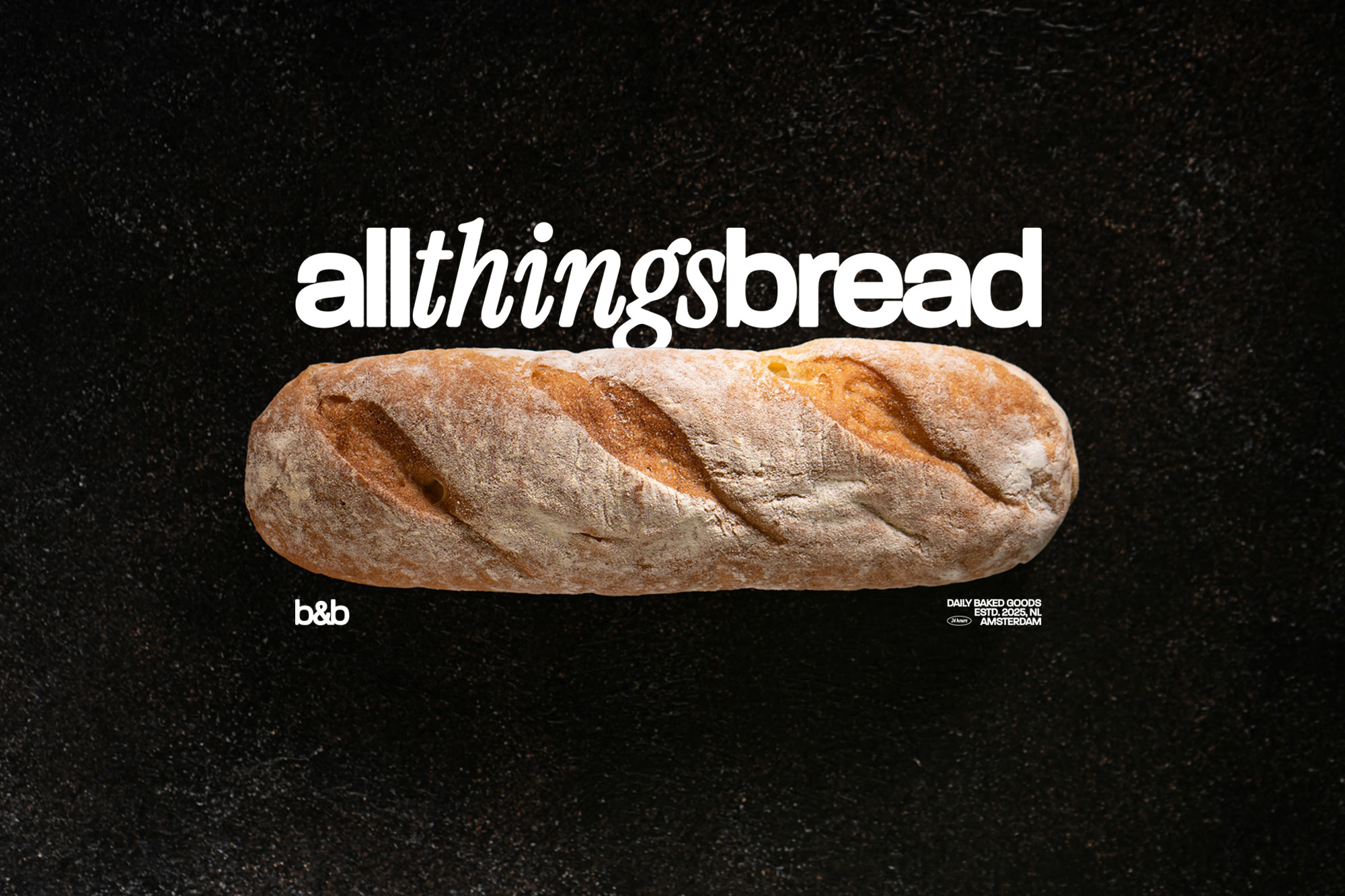
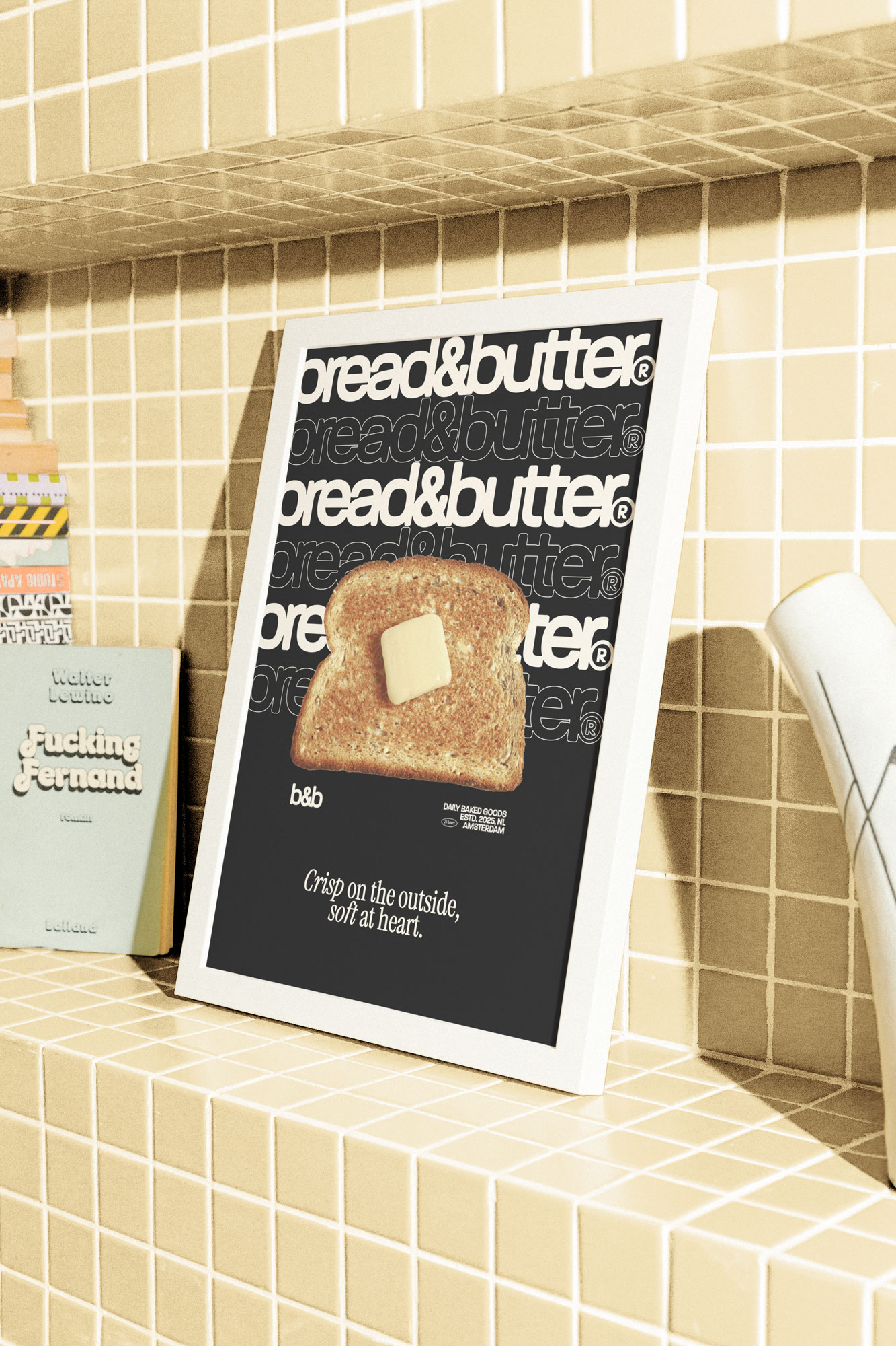
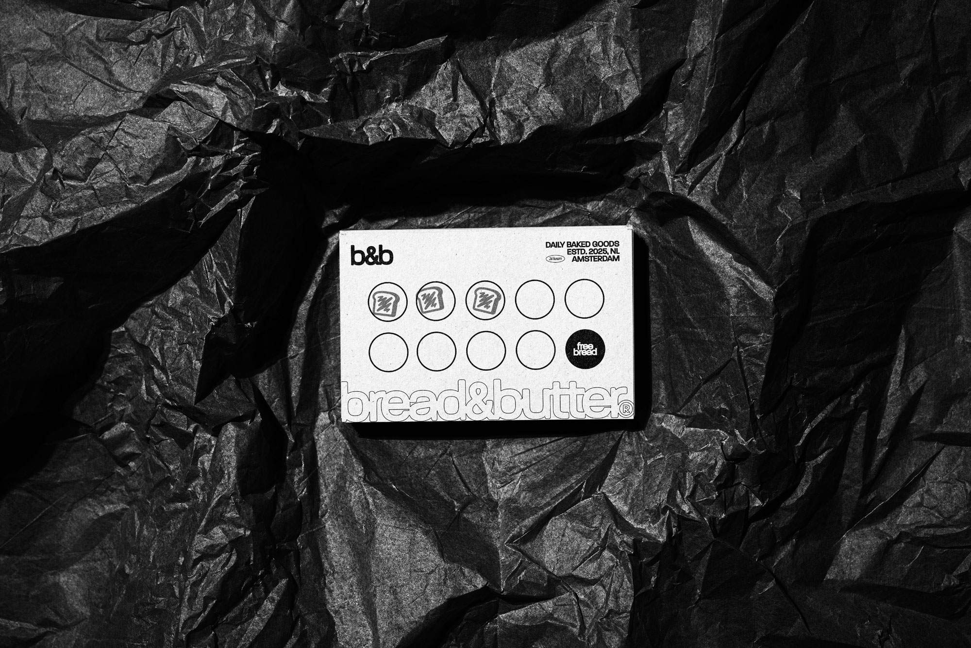
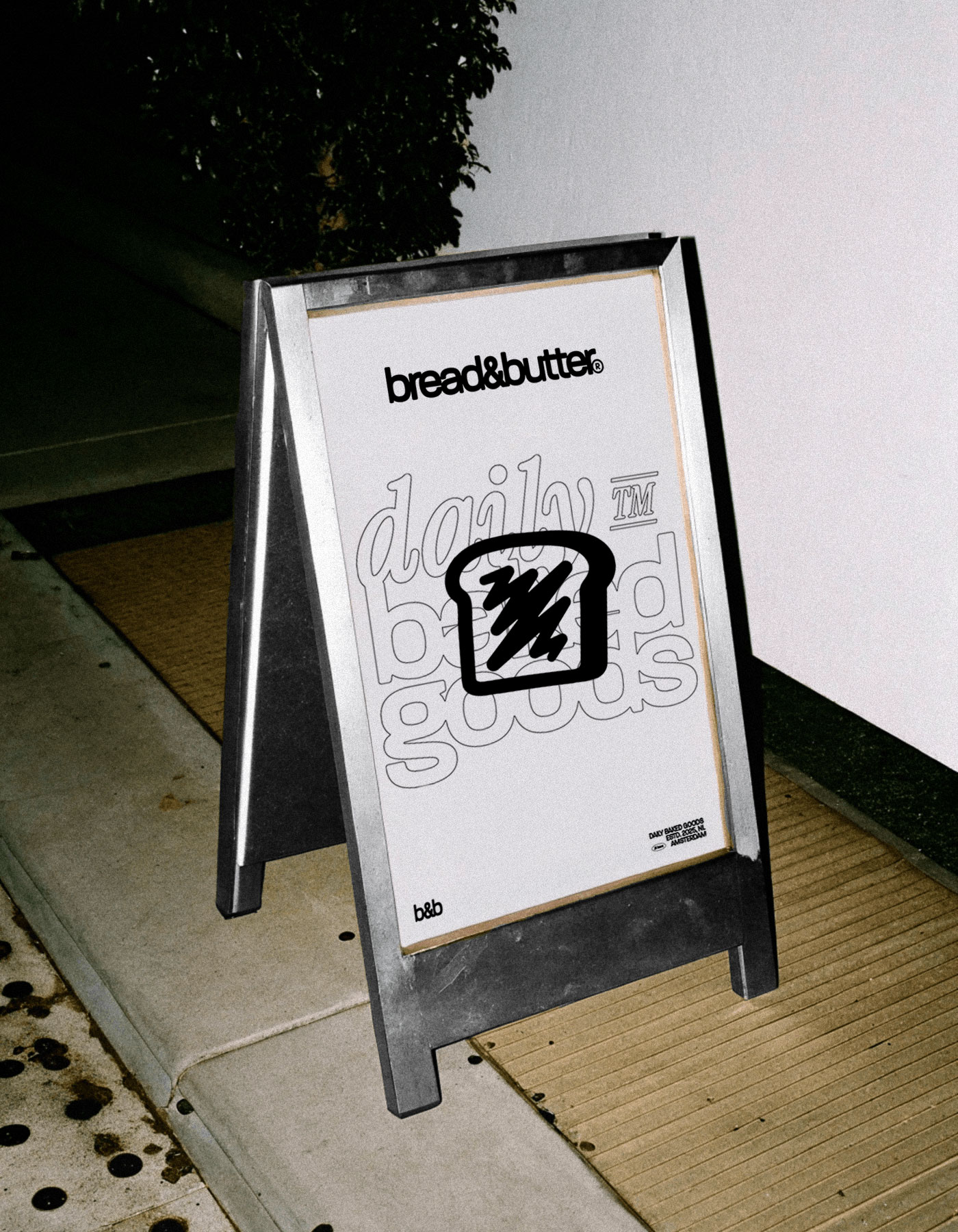
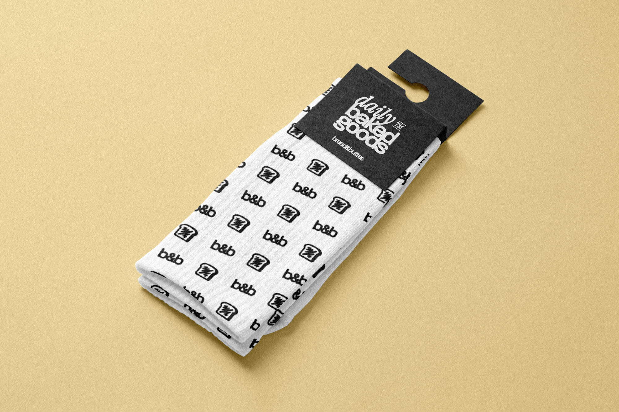
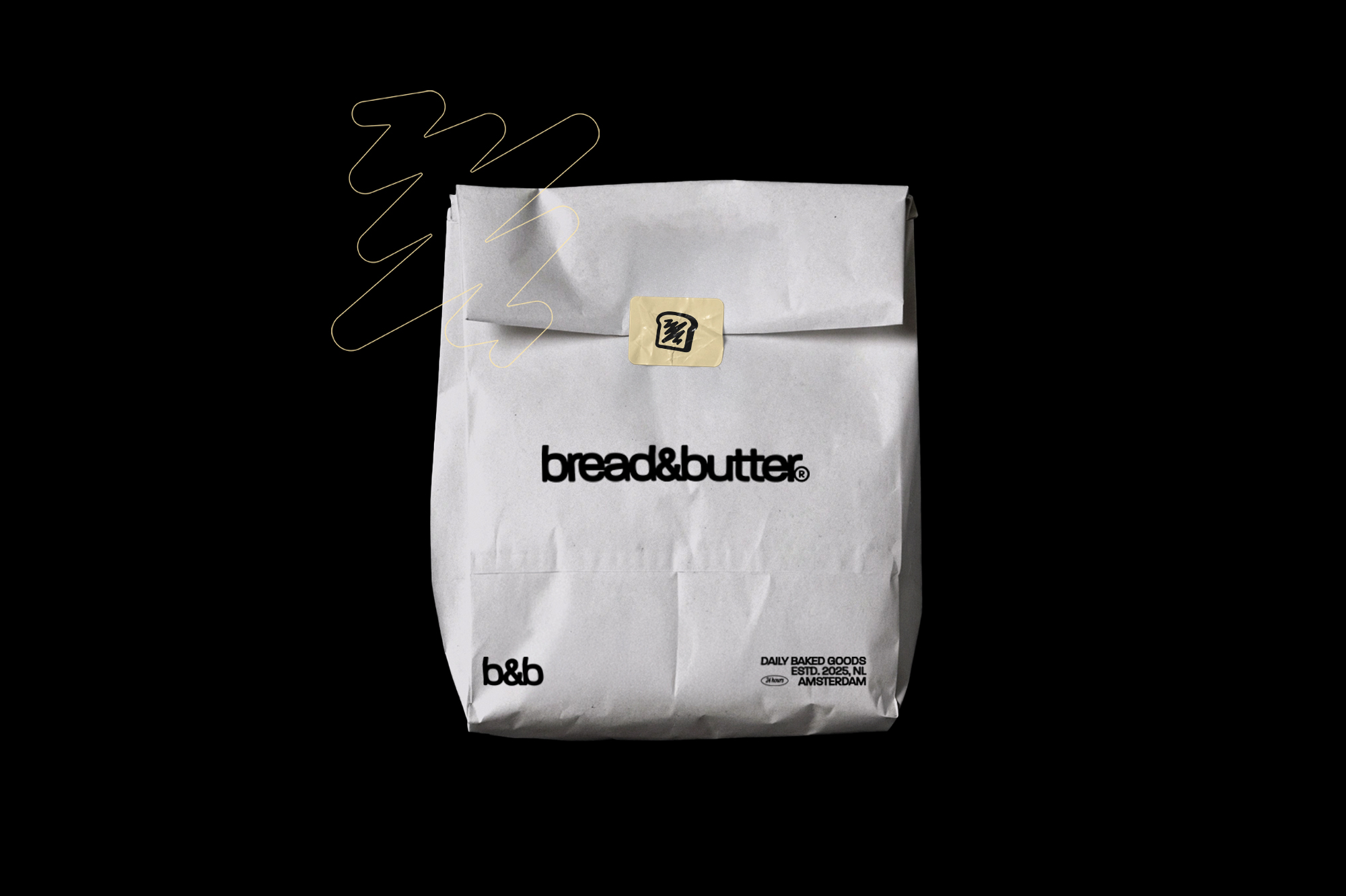
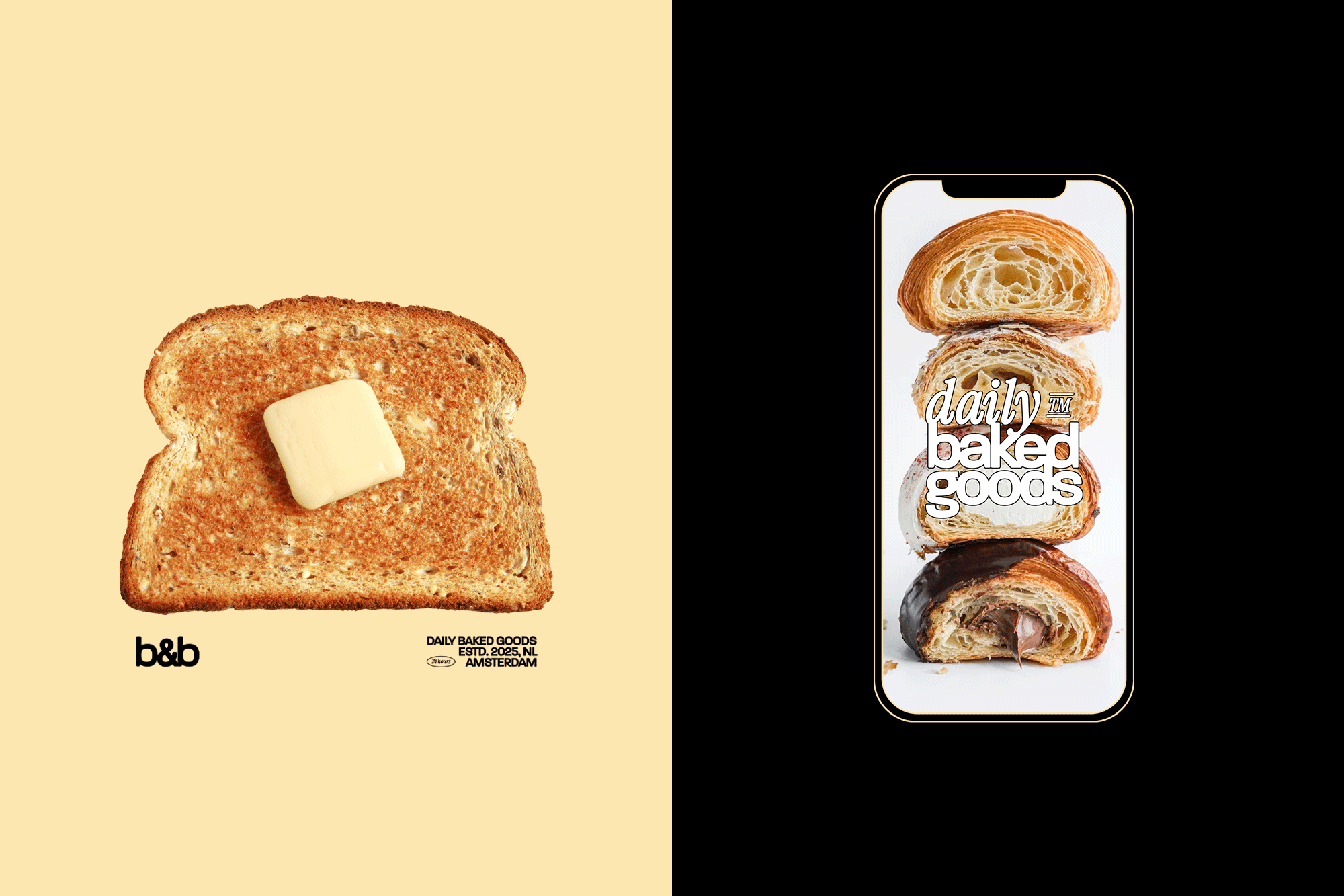
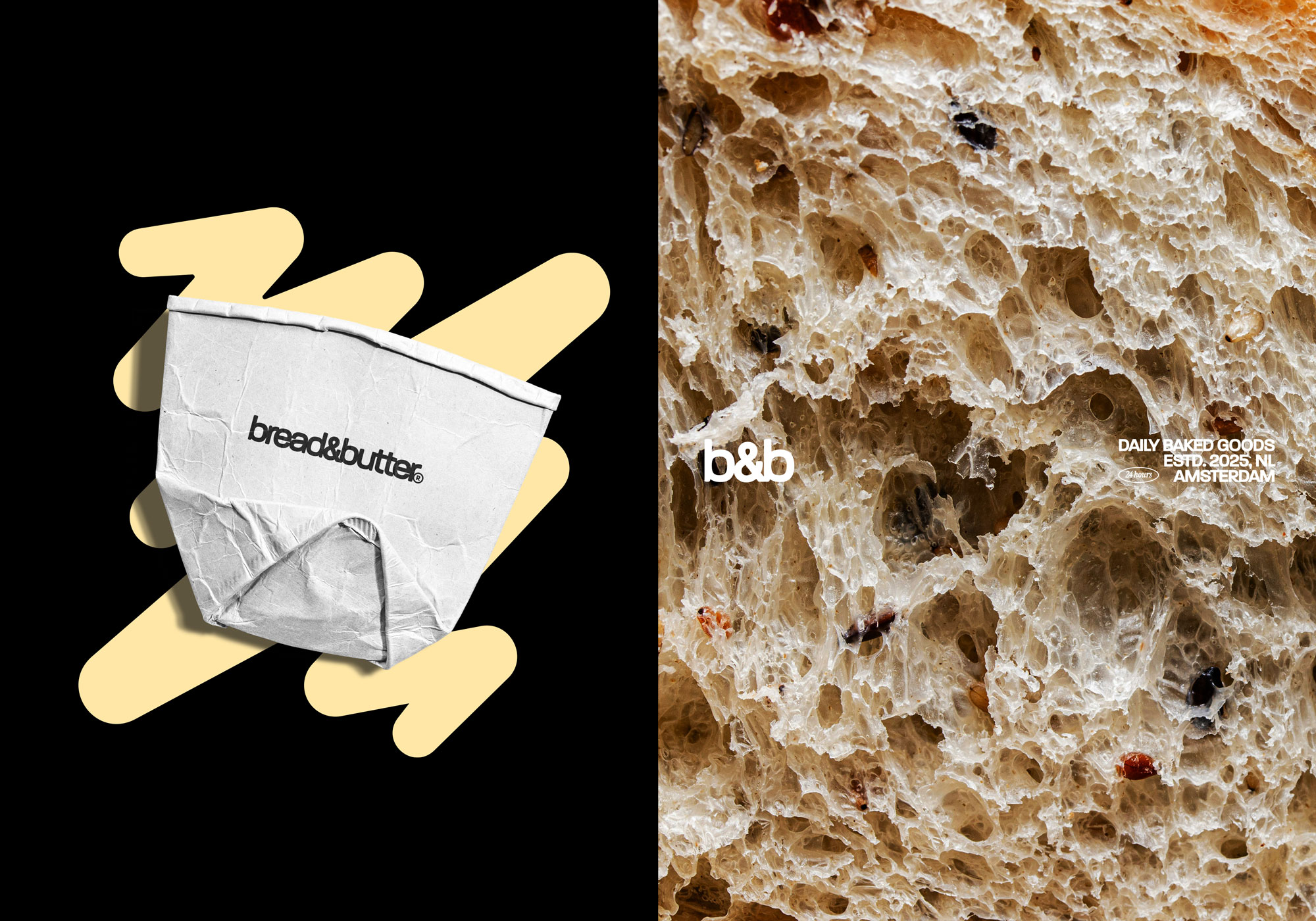
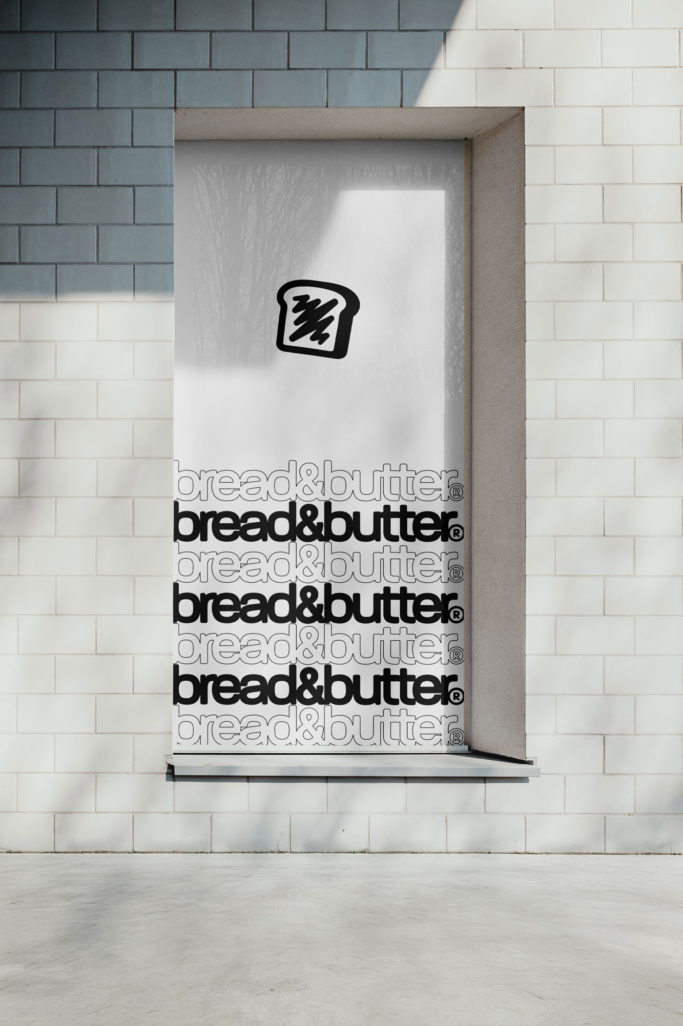
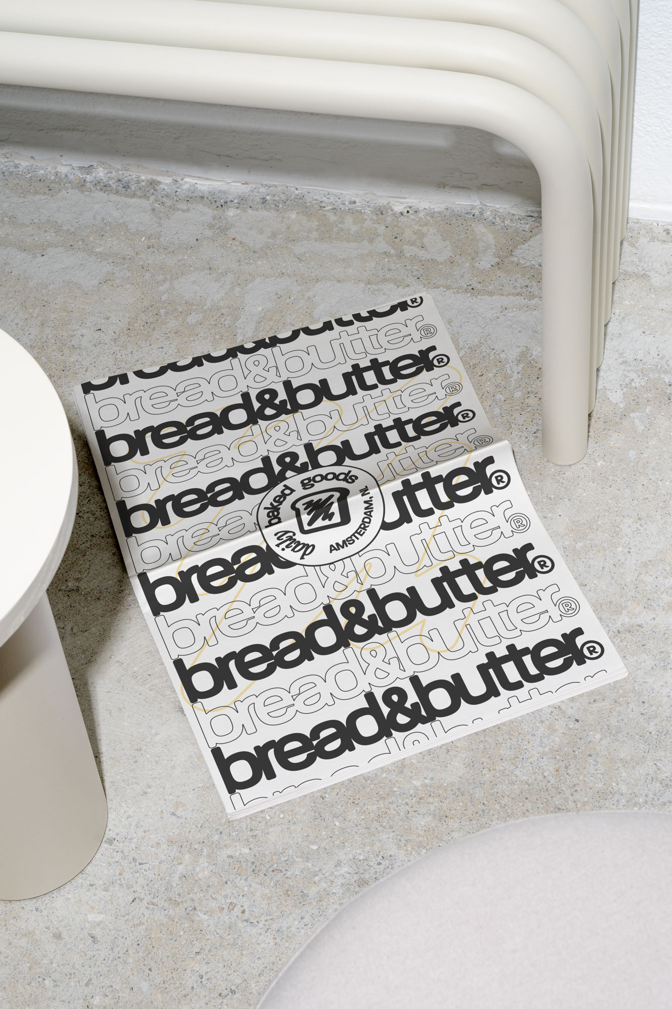
The visual identity was built around a minimalist approach, using a refined typography system and a bold logo. In addition to the logo is a playful yet refined brandmark – a toast slice with butter.
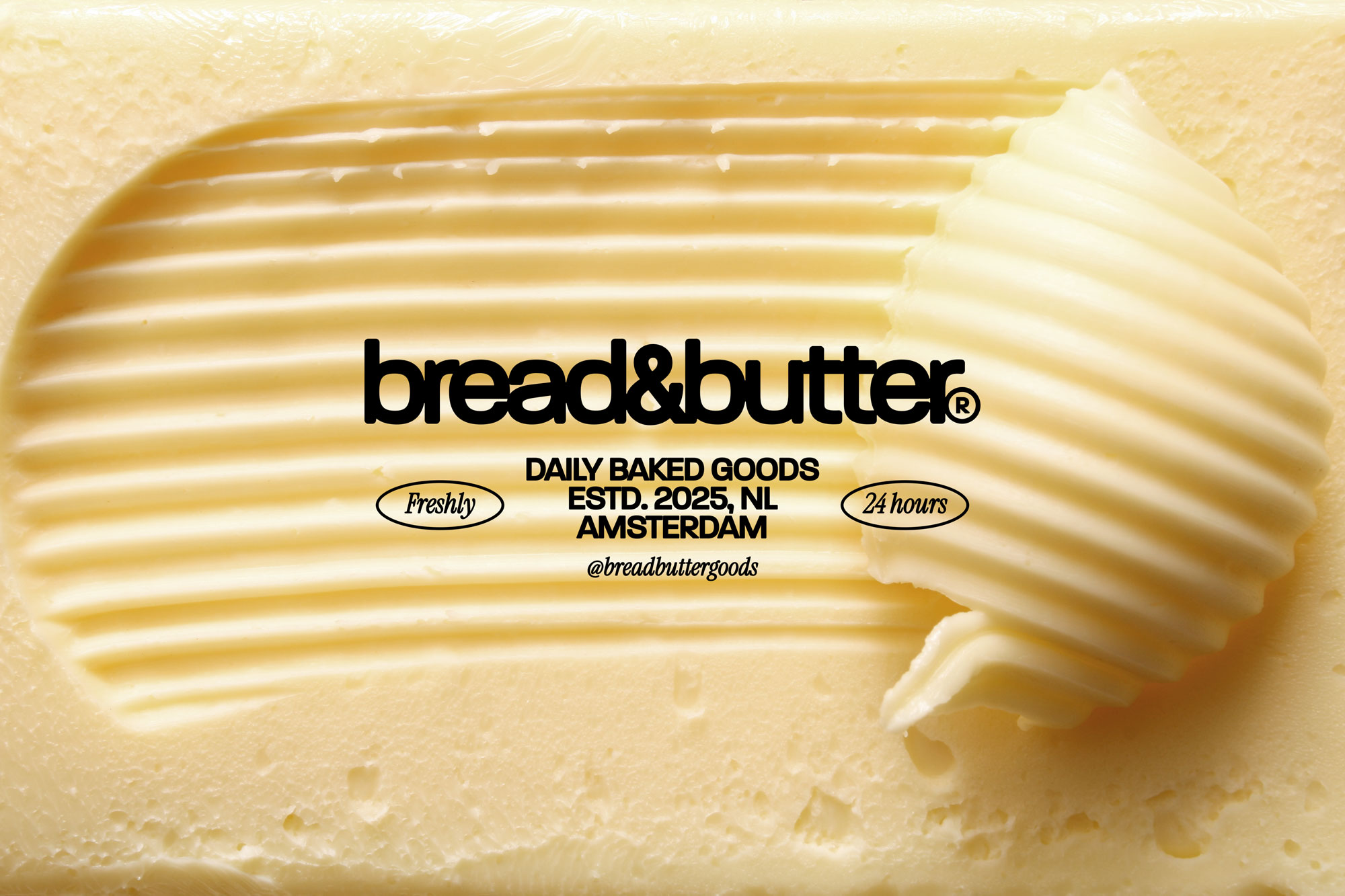
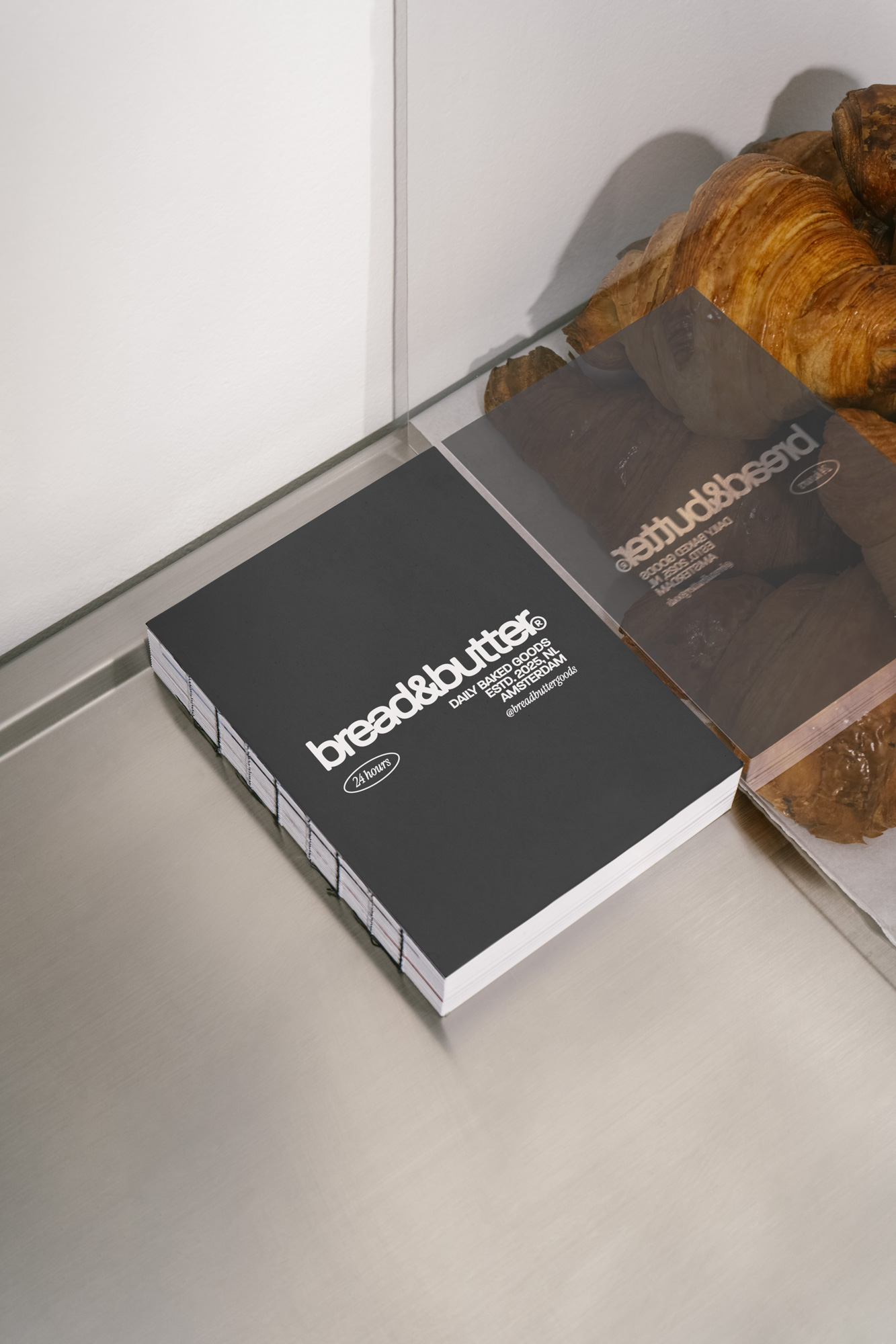
The logo is made with custom typography and balances boldness with simplicity, ensuring strong brand recognition. Subtle rounded details soften the edges, mirroring the bakery’s inviting atmosphere.
The brandmark might be a bit obvious, but was made to capture the essence of the bakery and evoke recognition. Its simplicity ensures versatility, making it effective across signage, packaging, and digital platforms.
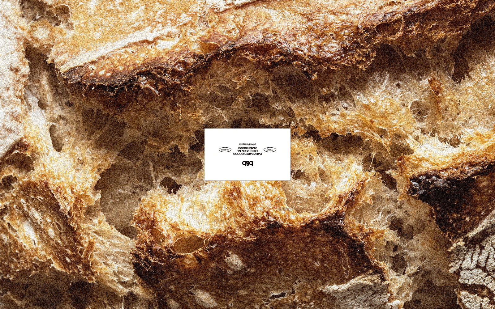
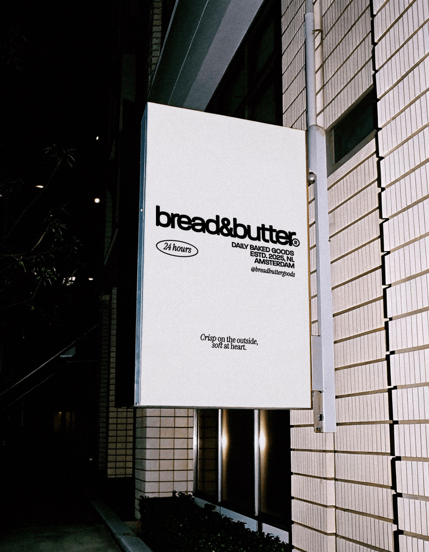

The color scheme consists of buttery hues, mixed with black and white. The rich, natural colors evoke the freshness of the bakery, while the bold contrast of black and white lends a modern edge. This balanced palette reinforces Bread&Butter’s quality and style.
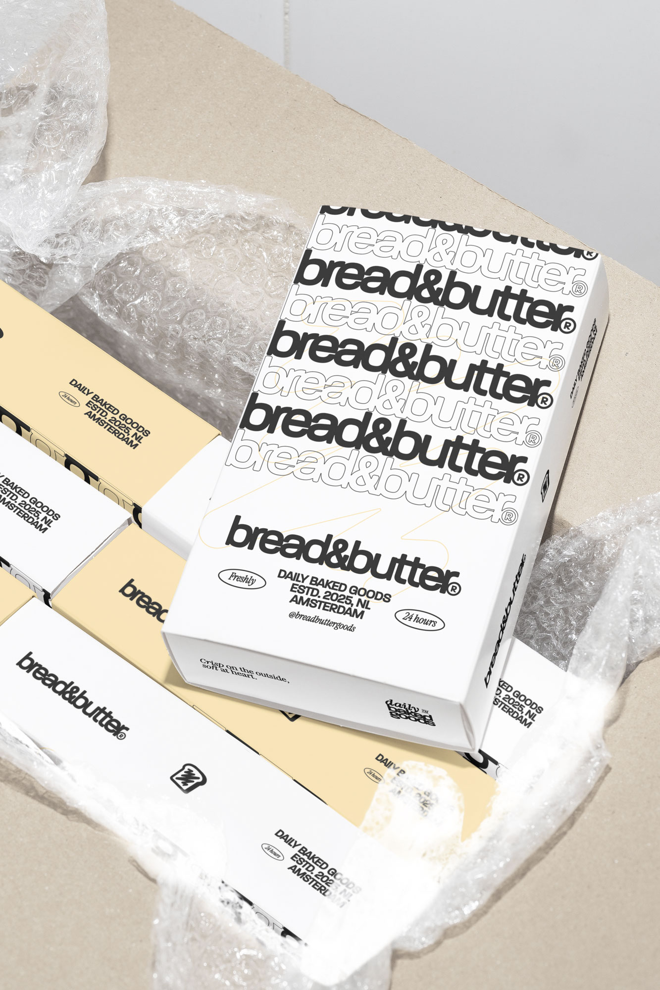

The consistent application of the new identity across all touchpoints has created a seamless and engaging brand experience. This cohesion reinforces customer trust and communicates the bakery’s commitment to freshly made baked goods.
Overall, the new visual identity has not only solidified the bakery’s image but also played a key role in driving its growth and establishing a lasting connection with its customers.