Brand identity
Handpicked Classics
Vintage thrift shop specializing in finding and selling timeless furniture and elegant home decor.
It all started when Handpicked Classics was on the lookout for a logo and visual identity for their Instagram business.
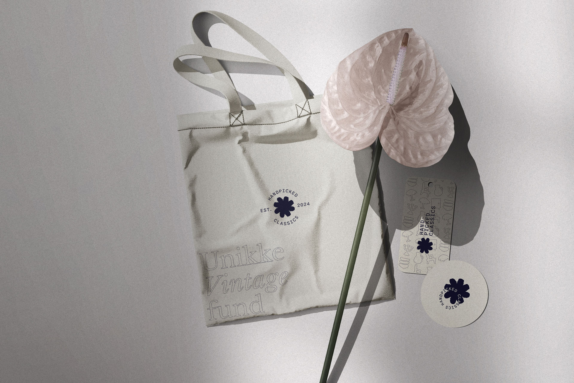
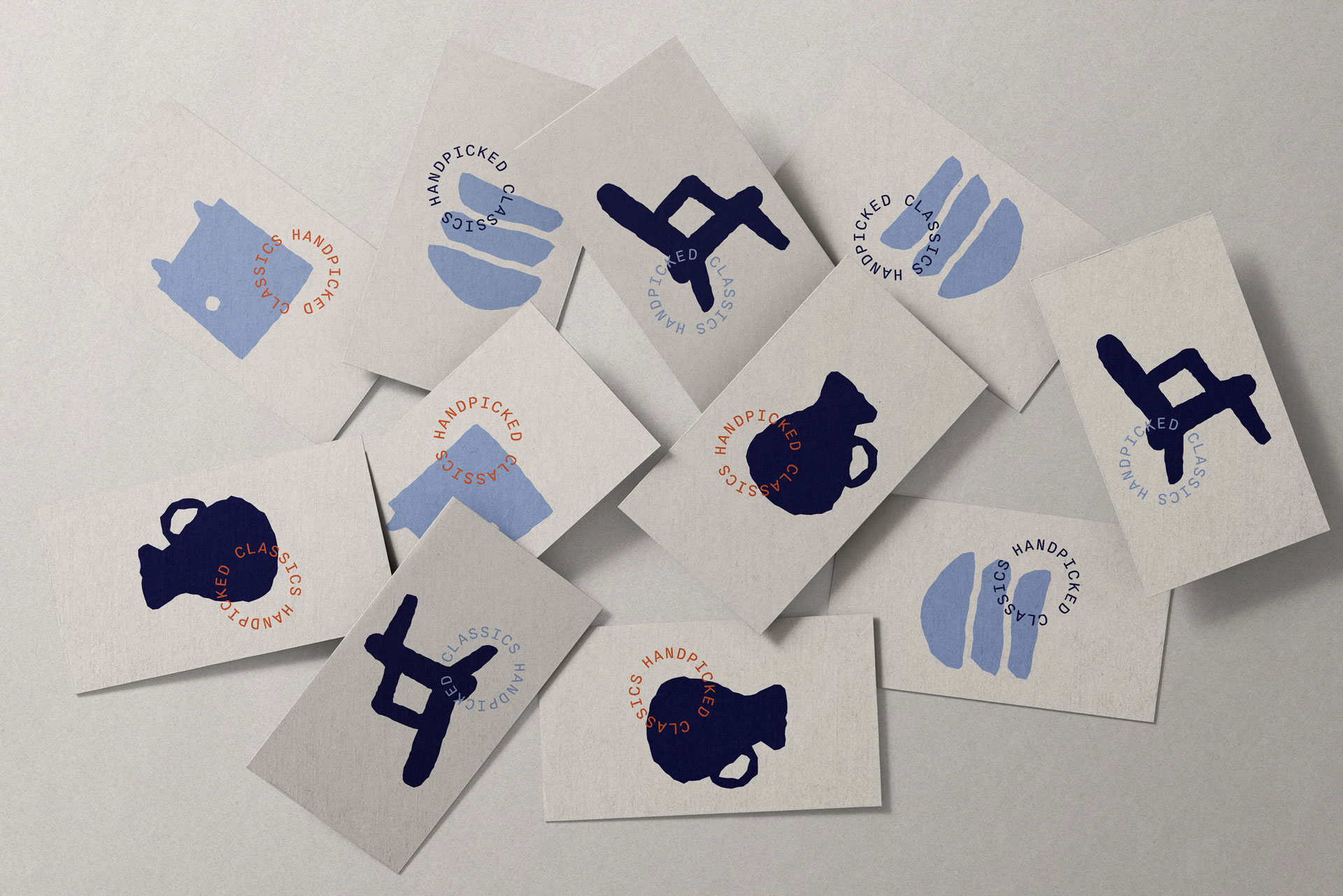
The goal was to create an identity with a sense of nostalgia while maintaining a contemporary appeal. At the heart of the brand’s visual identity is the logo, which features a vintage-inspired font paired with a handpicked mark: a star.
Starred
The logo contains a star to represent a handpicked item.
Typewriter
The typography has a retro typewriter feel for a vintage look.
Crooked edges
The edges are uneven to underline the identity’s retro style.
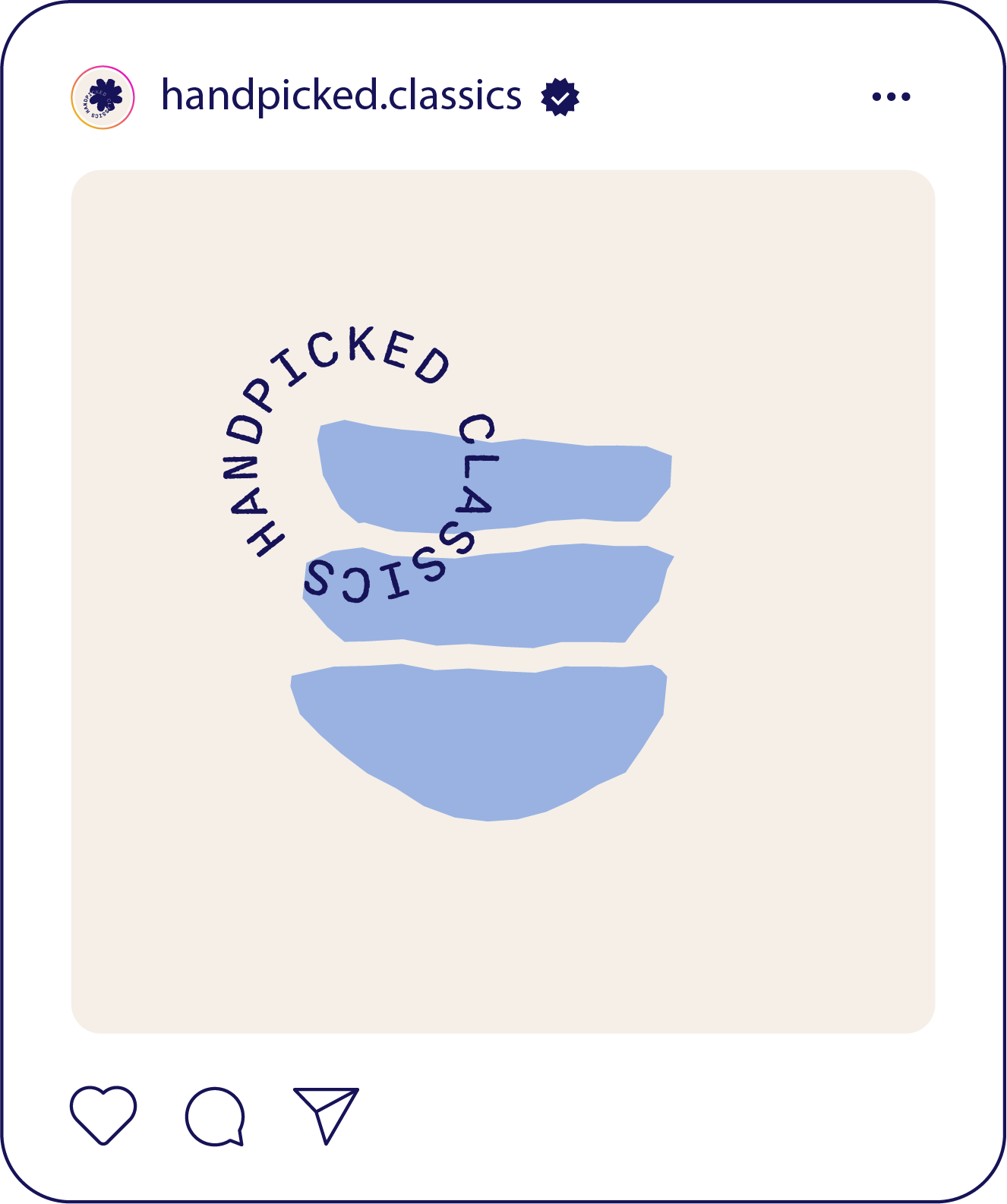
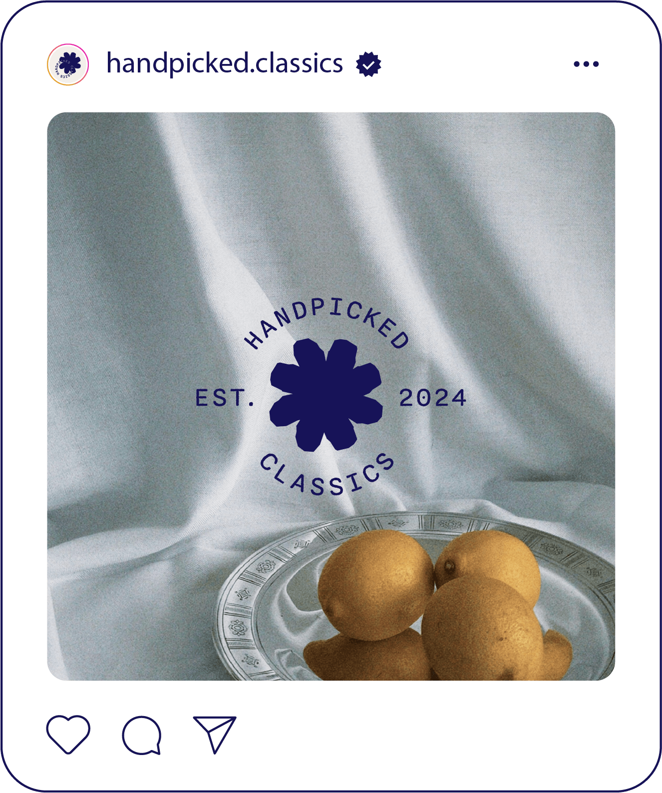
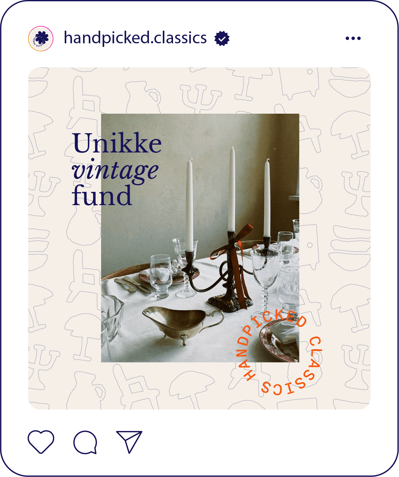
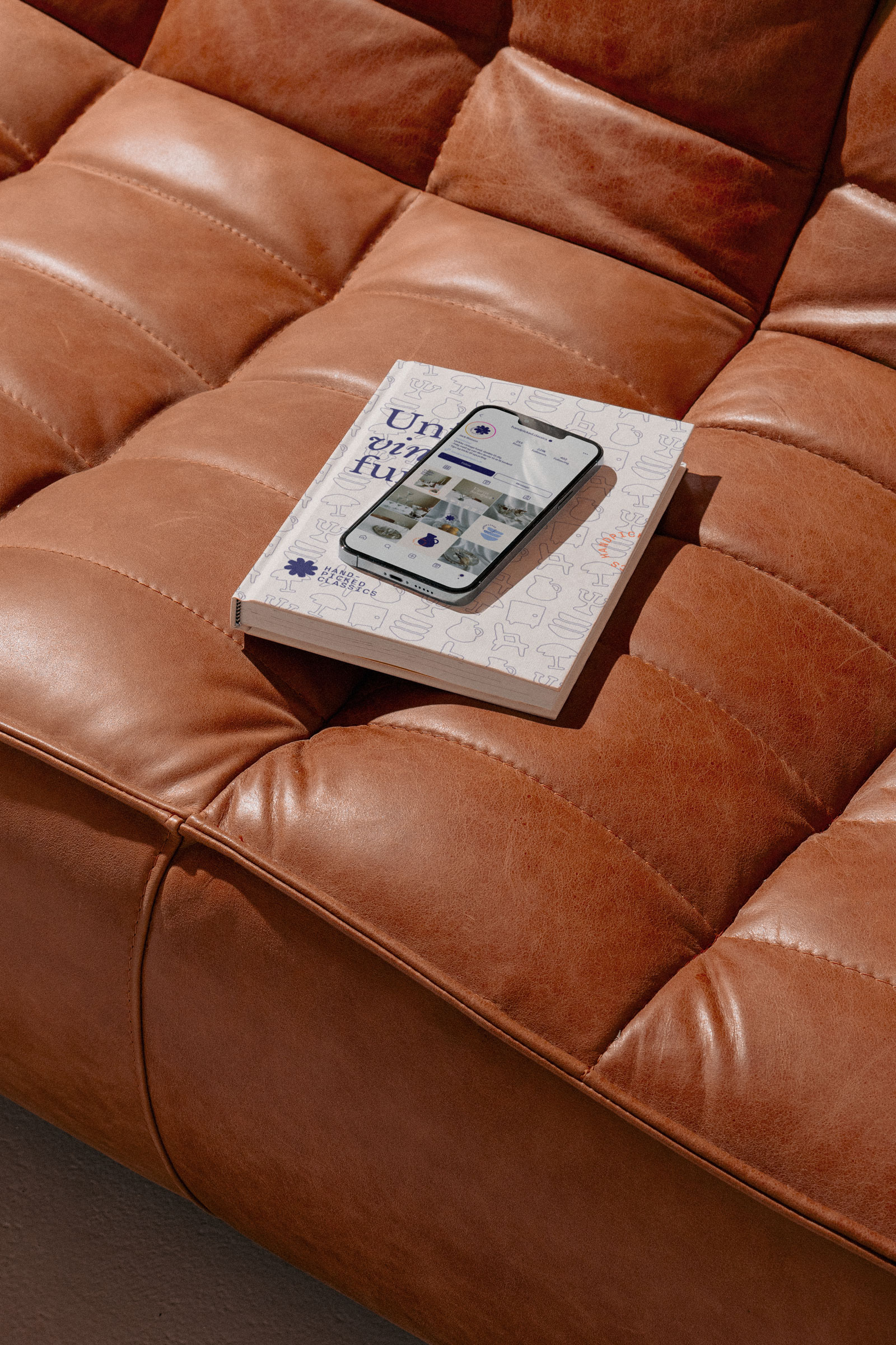
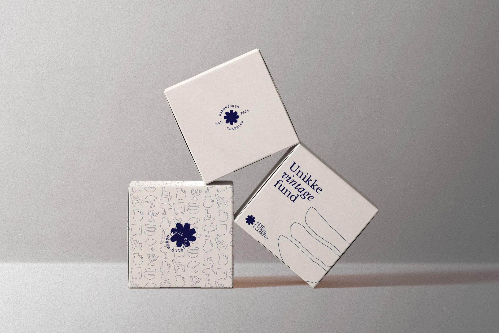
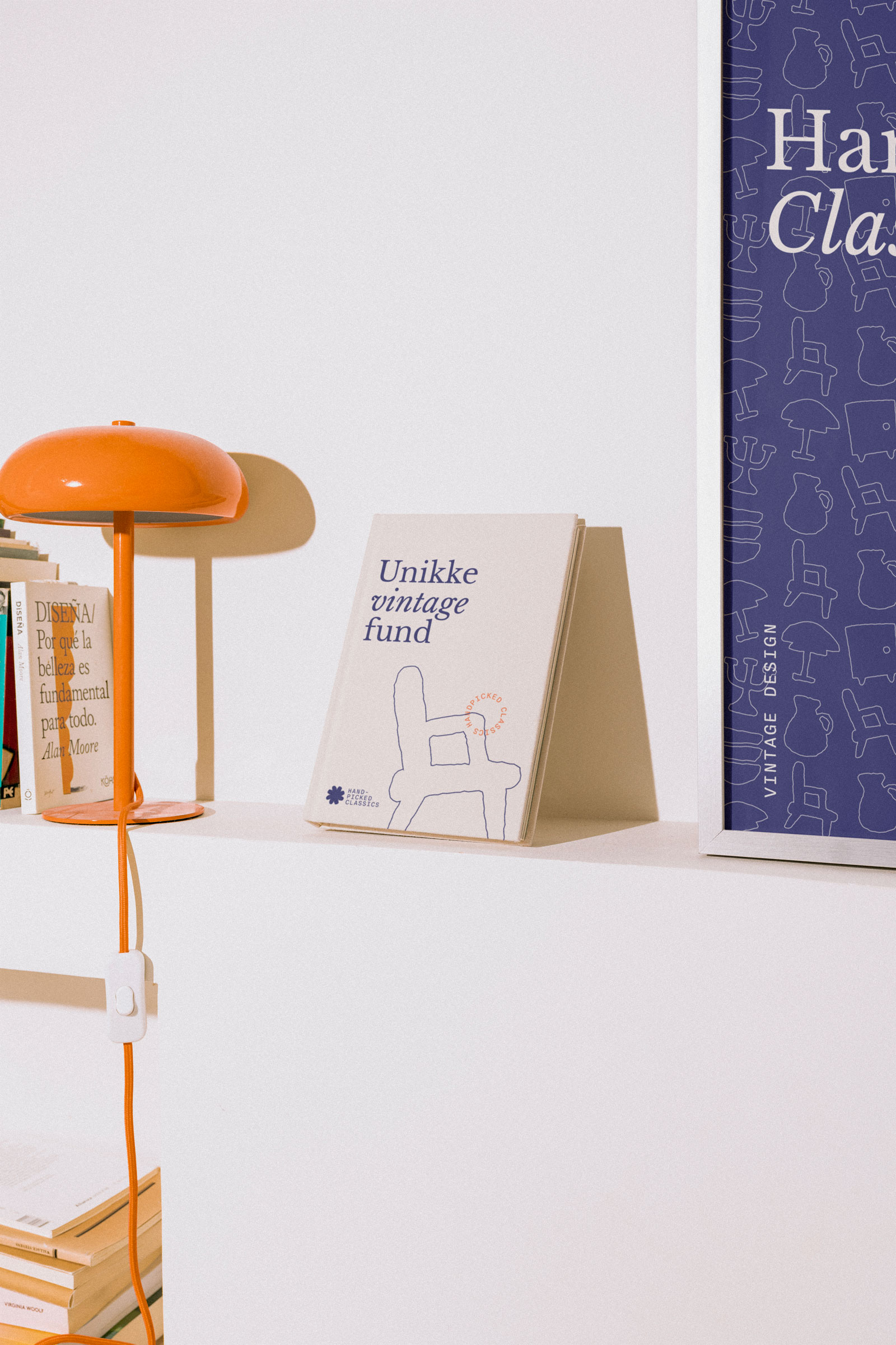
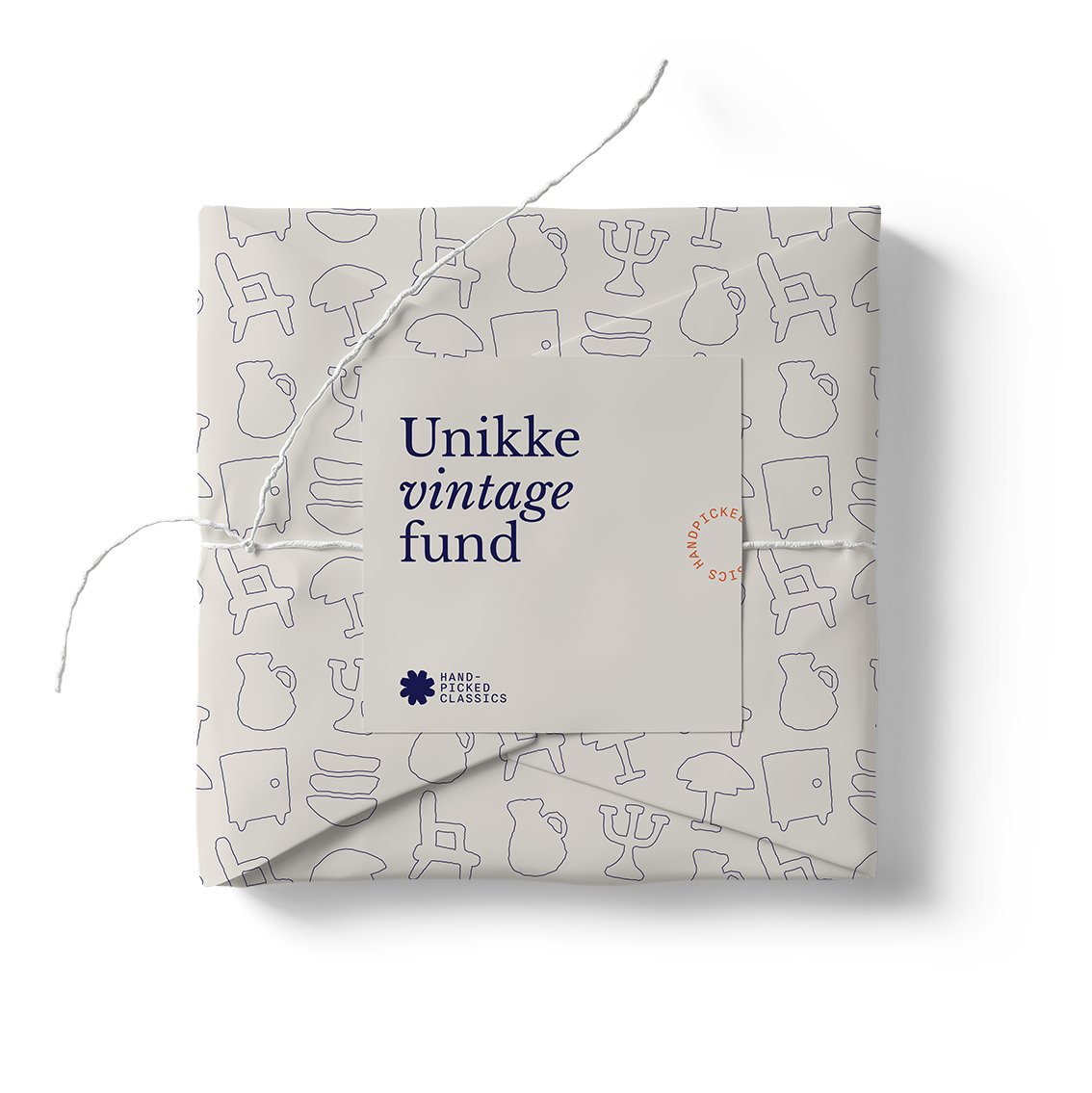
Across various touchpoints, from Instagram posts to packaging, the visual identity remains consistent, creating a cohesive brand experience. Every detail, from the choice of typography to the color scheme, was carefully considered to capture the essence of Handpicked Classics – a haven for those who appreciate the beauty of vintage items and the stories they tell.
Deep blue
#161554
22.21.84
100.97.38.32
Pantone 2766 C
Dusty sand
#f4efe9
244.239.233
5.7.9.0
Pantone P 1-1 C
Sky blue
#9eb2dd
158.178.221
43.26.0.0
Pantone 651 C
Bright orange
#e5622e
229.98.46
4.72.86.0
Pantone 7579 C
The main channel of business and communication is Instagram. The consistency in the visual identity ensures an engaging Instagram presence, inviting followers to explore the world of retro home decor with every scroll.
