Brand identity
Urban Italiano
The go-to spot for authentic, homemade Italian pasta in Brooklyn, New York.
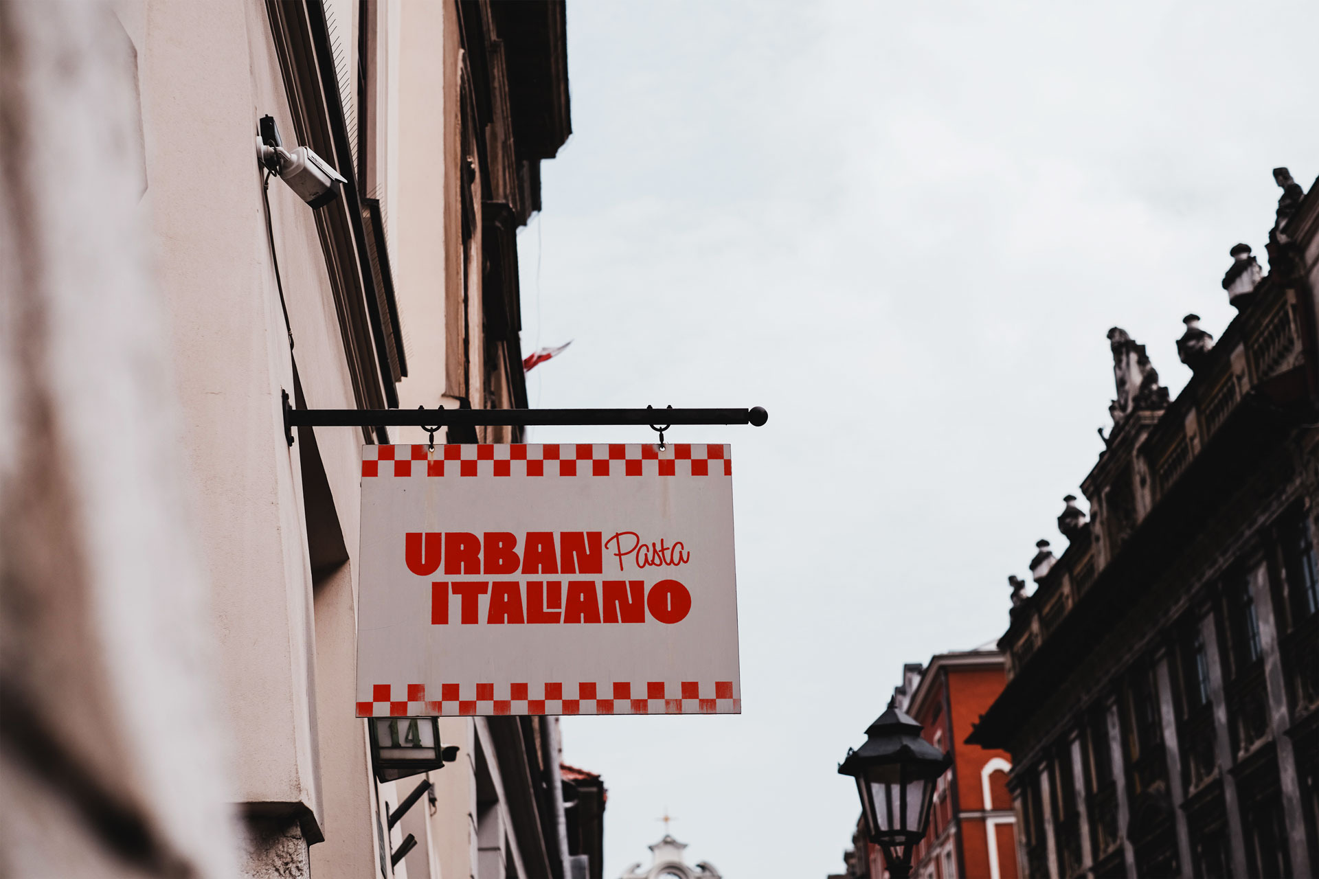

Urban Italiano, a historic Italian pasta place based in Brooklyn, New York, has been a neighborhood staple since 1903. Known for its authentic Italian flavors and deep-rooted legacy, the restaurant has long been a beloved spot for both locals and tourists. With over a century of heritage, Urban Italiano sought to refresh its visual identity to resonate with modern audiences while preserving its rich cultural history.
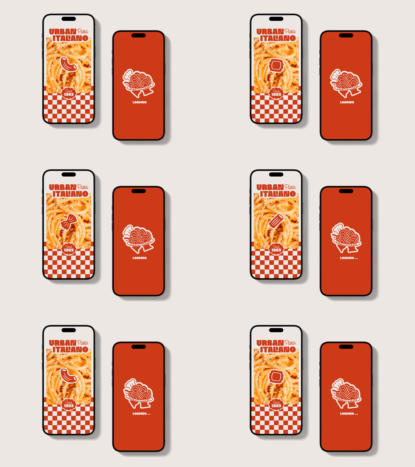
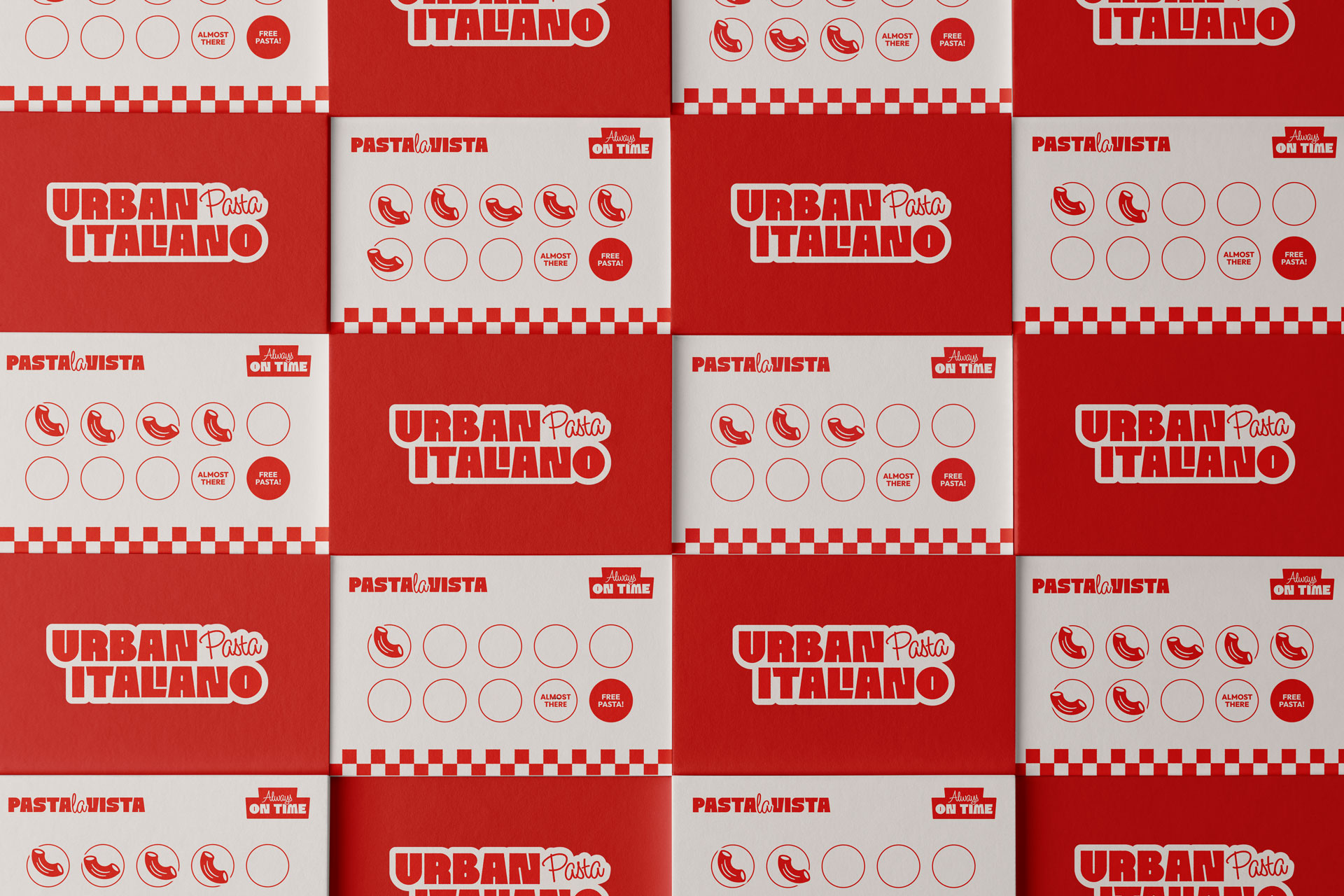
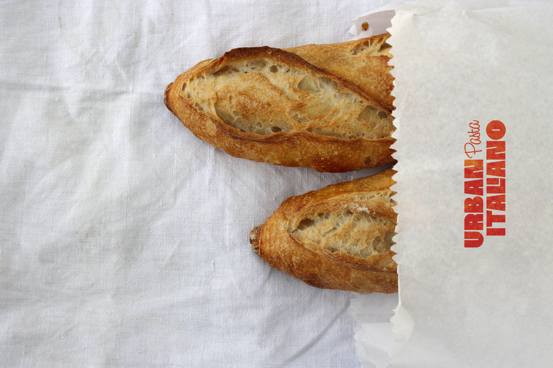
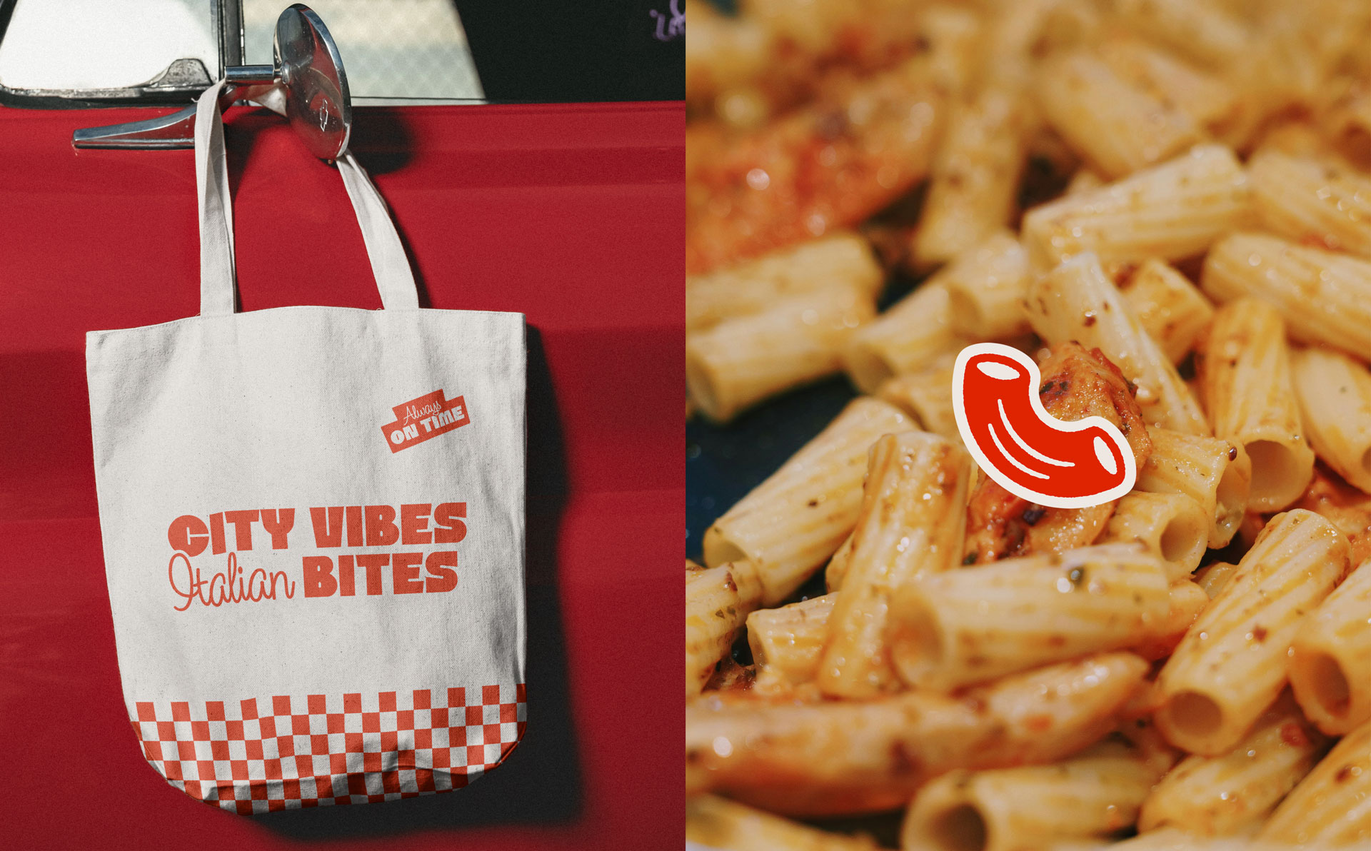
The primary objective was to create a visual brand update that connects Urban Italiano’s legacy to the modern era. The new identity needed to reflect the timeless essence of the restaurant while ensuring it remains relevant and appealing to future generations. This required a comprehensive visual identity update, including a logo suite, takeaway packaging, apparel, menu cards, etc.
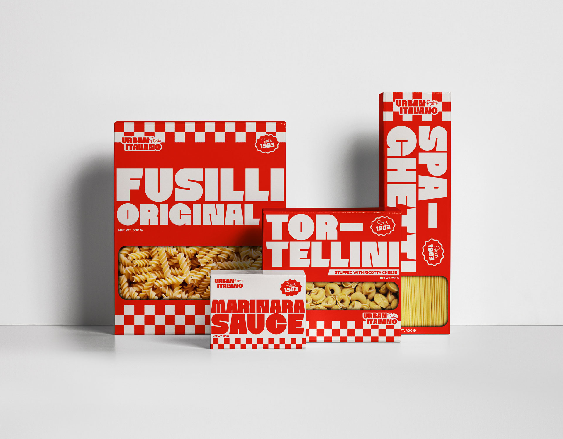
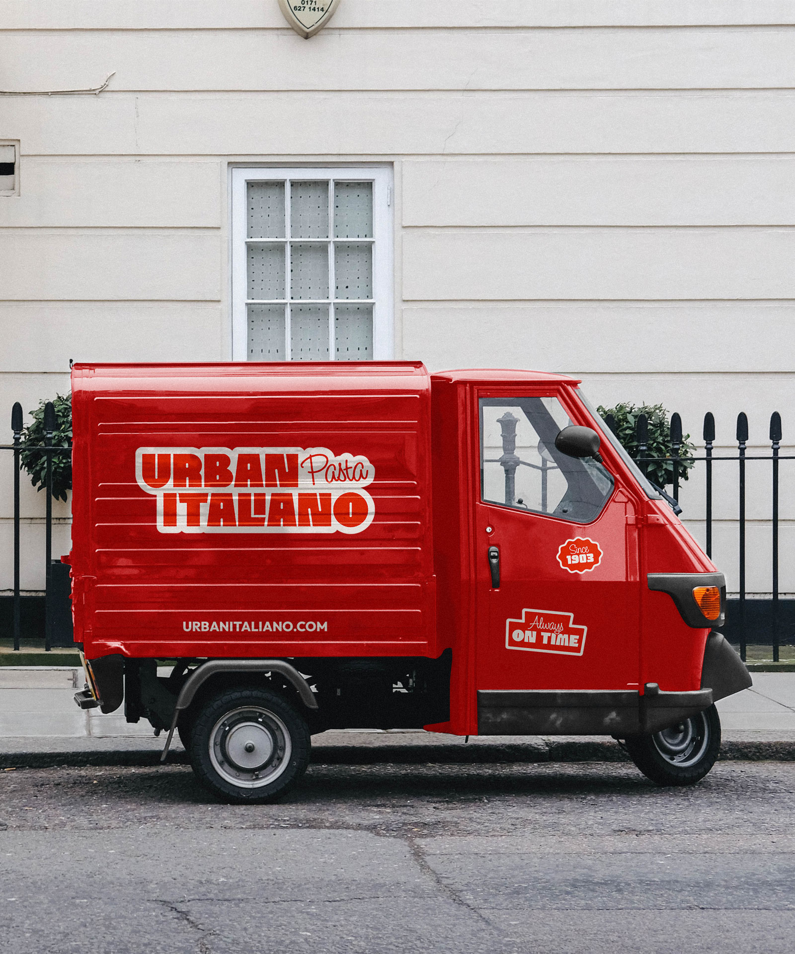
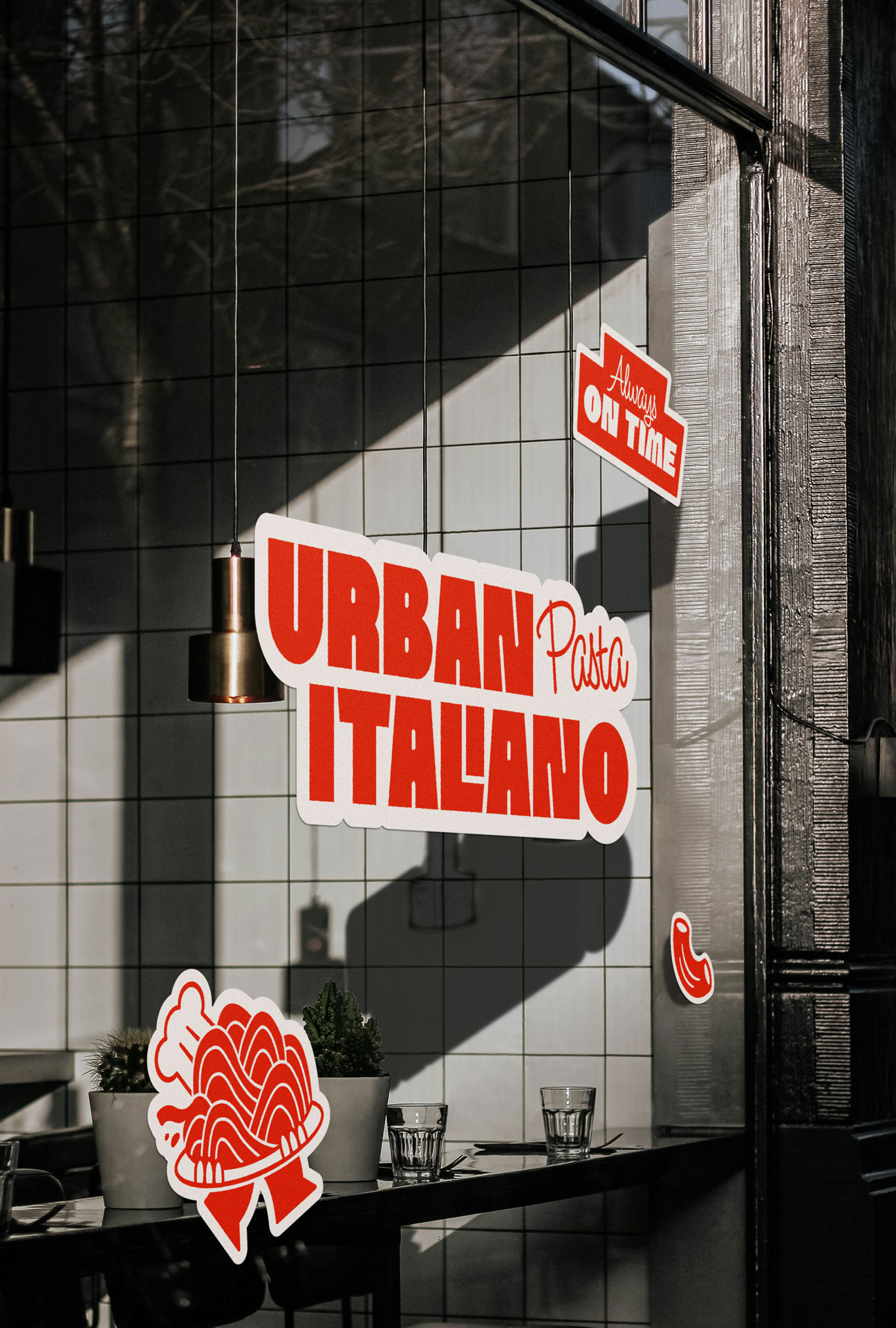
The brand positioning for Urban Italiano was centered on being a bridge between the past and the present. It aimed to be recognized as a modern, vibrant Italian eatery that honors its rich history. The visual identity was designed to reflect this, blending vintage elements with a modern vibe to create a timeless look.
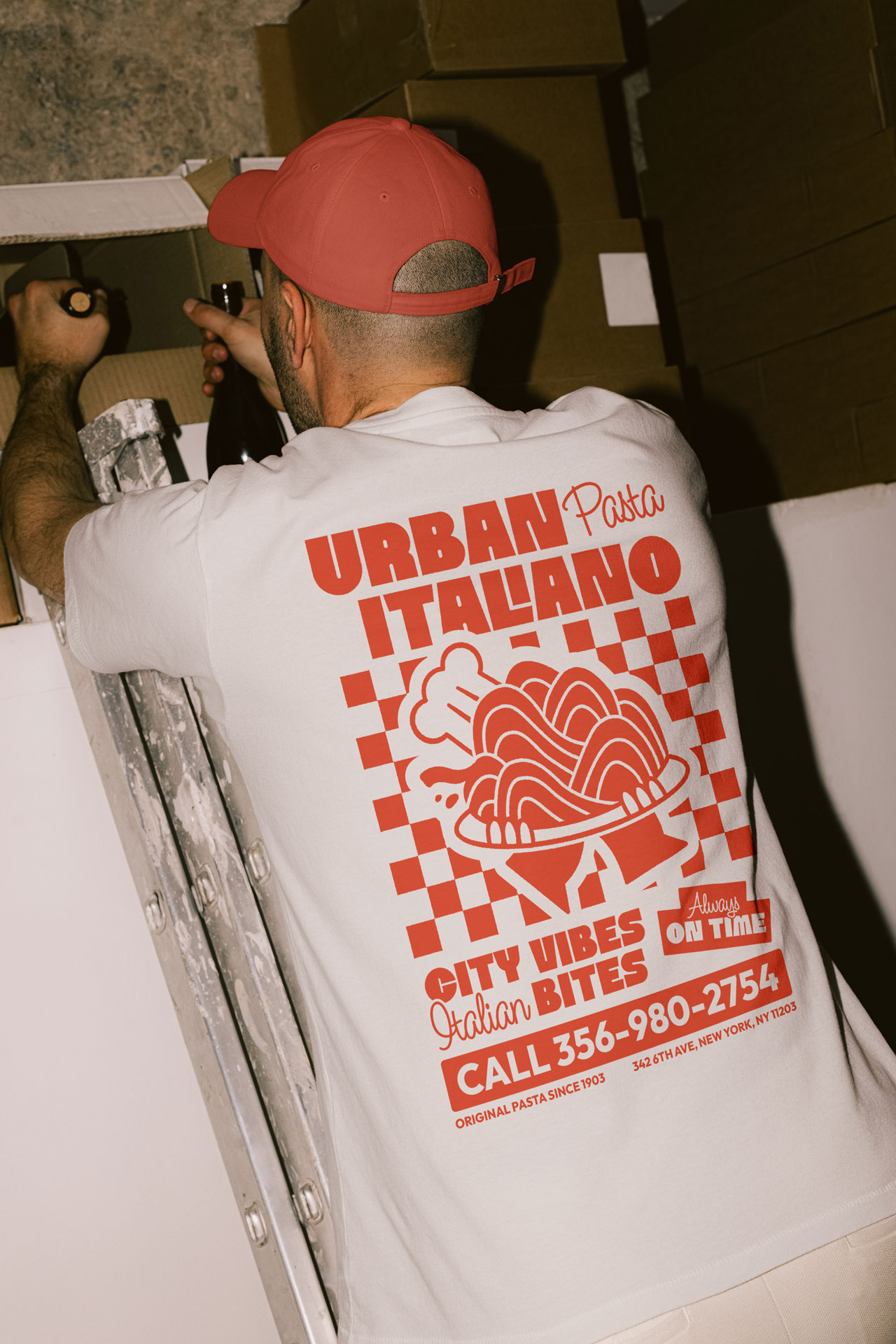
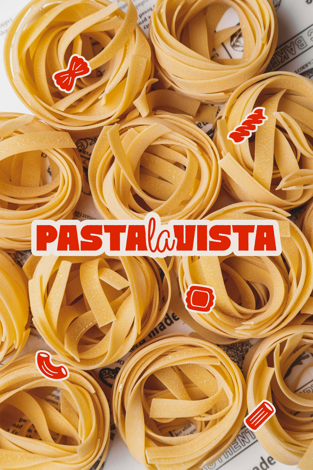
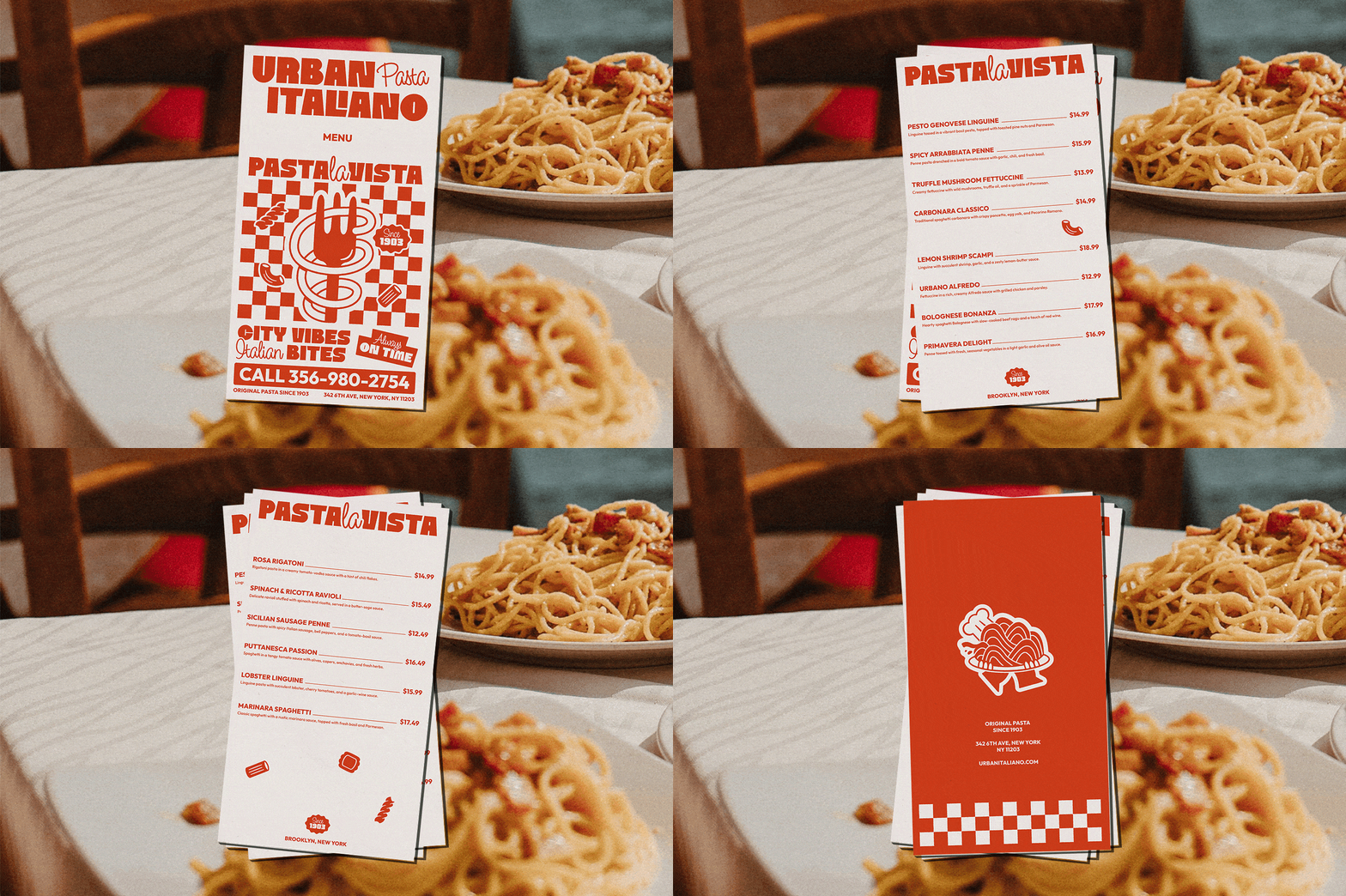
The creative process began with conceptualizing a logo that would encapsulate the essence of Urban Italiano. The result was a modern and playful logo with a vintage twist.
A mascot was also developed to serve as a friendly ambassador for the brand, embodying the warmth and authenticity of the restaurant. The mascot was designed to be versatile, working across various marketing platforms, both online and offline, and adding a playful yet respectful touch to the brand.
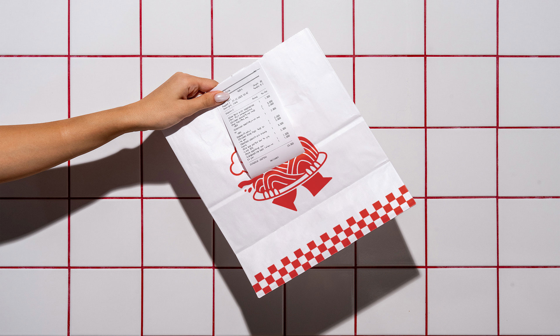
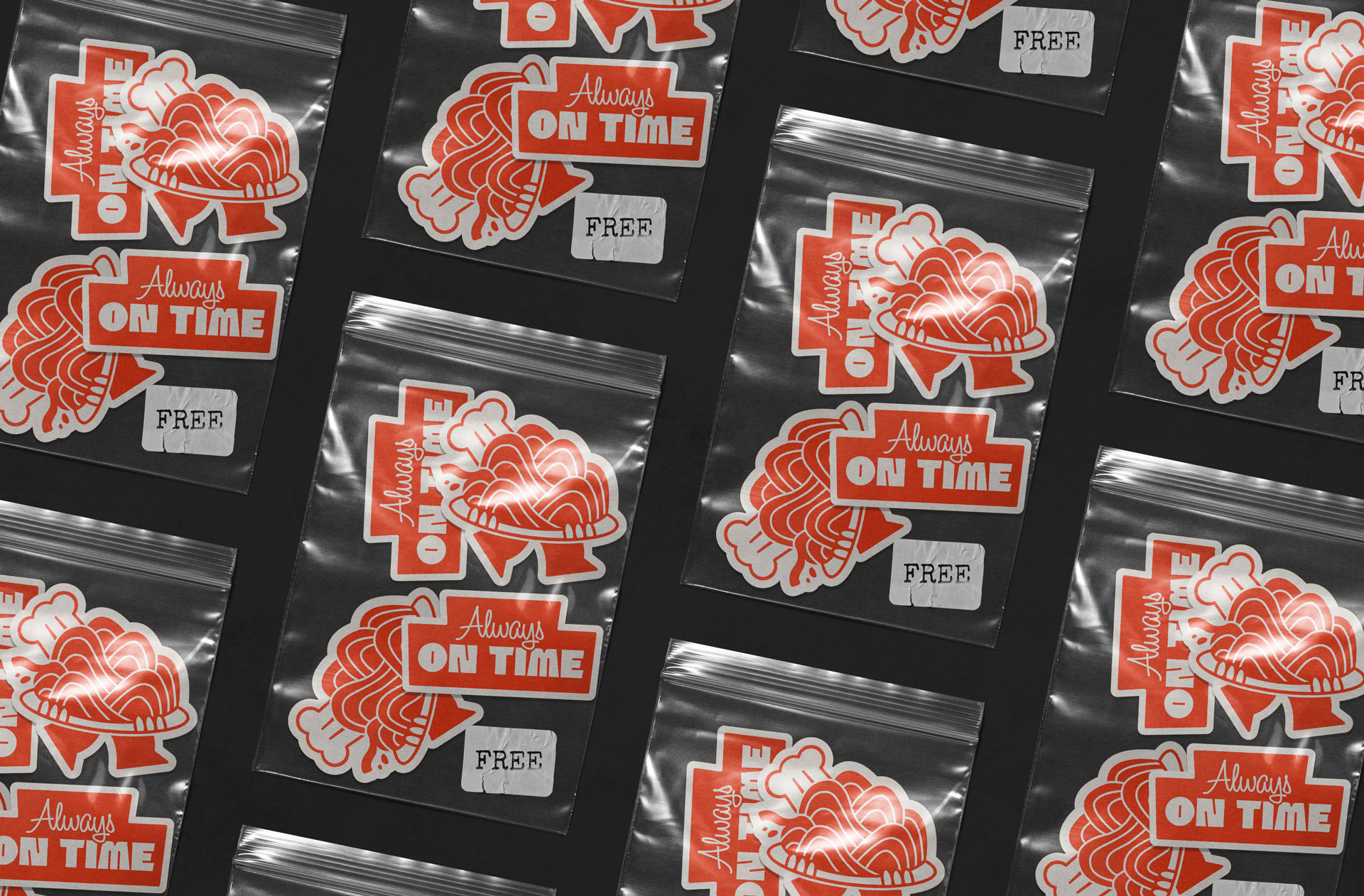
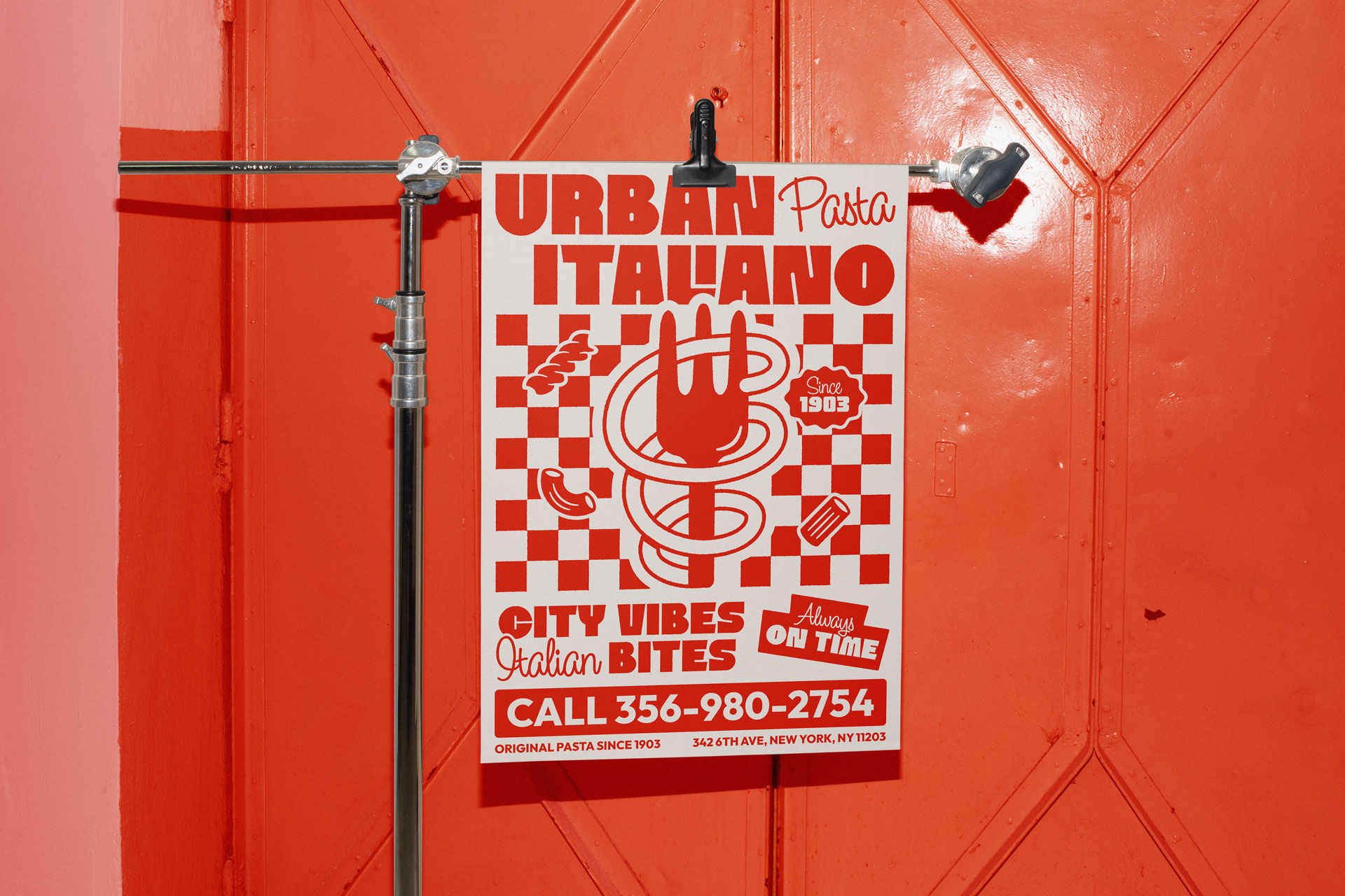
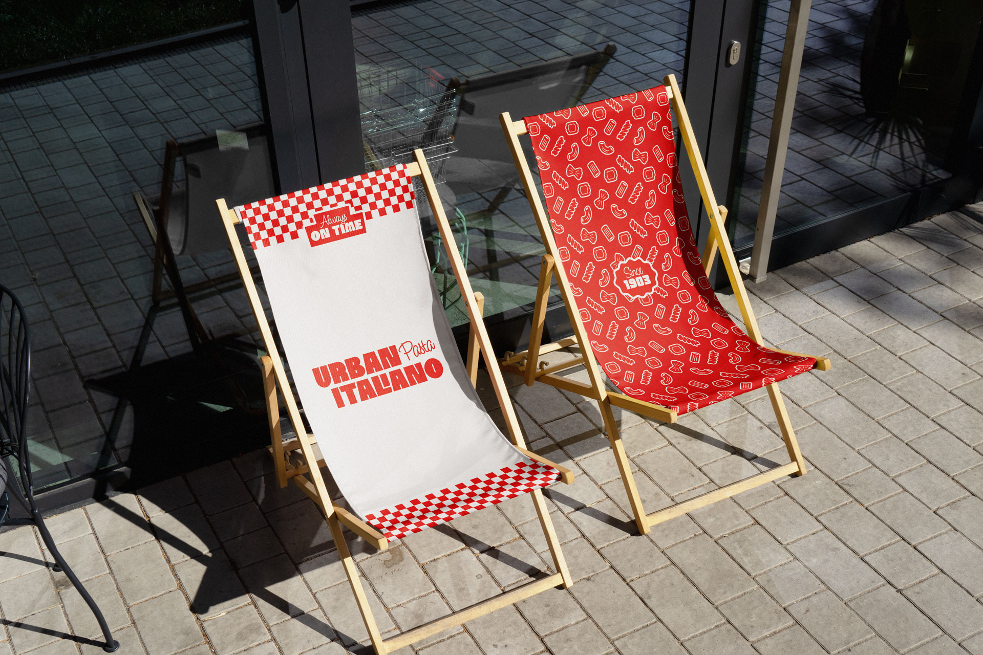
The brand redesign has provided a solid foundation for future growth, positioning Urban Italiano as both a historic landmark and a vibrant, evolving dining destination – well-equipped to continue its legacy in Brooklyn’s ever-changing culinary landscape.
